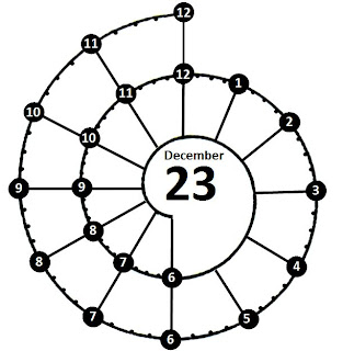
The original chronodex system was designed by Patrick Ng.
Here is a link to see his work:
http://scription.typepad.com/blog/2011/11/scription-chronodex-weekly-planner-
2012-free-download-with-the-cost-of-a-prayer.html#.UWFMfZNvB2A
And here's my video looking at the chronodex system and how I created my own Spiral organizer.
Here is a link to see his work:
http://scription.typepad.com/blog/2011/11/scription-chronodex-weekly-planner-
2012-free-download-with-the-cost-of-a-prayer.html#.UWFMfZNvB2A
And here's my video looking at the chronodex system and how I created my own Spiral organizer.
It is a trial only as I need more time to get my thoughts around this visual system
Watch the video - it says it all!
Here are the pictures of my spiral template with an unmarked one as well:
A few weeks after designing the above I took some time to modify the original design a little.
Here is the new design:
I quite like this new spiral as it has the 15-minute increments.
I removed the gray times in favour of small numbered dots.
This is because at a glance, most of us can tell the hour position without
needing the numerals.
It also is a bit neater.
I also toyed with a slightly different version with darker dots.
Please message me to tell me what you think.
I have also named this figure the Spiraldex so that my design is not confused with the other.
I based the spiral on the Golden Ratio which helps creates a Fibonacci Spiral but found it had to be shortened a little to create more even segments from 1 pm onward. I also tried to maintain the circular shape which is more aligned to a clock face than the Fibonacci Spiral which increases exponentially.
this amazing proportion can be found in a variety of natural and artistic designs.
Its dimensions have a pleasing and attraction to our minds and its sense of proportion just seems right.
Hence the visual attraction to the spiraldex shape I have designed. It is easy on the eye and the mind embraces it with some sort of natural connection.
I have also played around with a Week-On-2-Pages format for my A5 Filofax.
Here is the template so far...
And another version with slightly larger spirals on the left hand side.
I am still undecided as to which appears best. What do you think?
or perhaps a central version:
Here are some examples I found on Google where others have utilized the original chronodex graph in their own planners
It us most likely used as a work organizer.
Another work organizer with a date stamp used as well. I think it is a moleskin notebook.
This one diagram per page design is more like what I like to use.
There is a lot of space for broad diagrams, sketches, writing an planning.
Another planner with three-days-per-page with an opposite page for notes and diagrams.
the original Patrick Ng chronodex.
It looks like there is now an ink stamp available
Here is a link to the Chronodex FaceBook page which covers information about the stamp:
http://www.facebook.com/chronodex/posts/280345952042794


Do you know where the stamp is available from please?
ReplyDeleteHere is a link to the Chronodex FaceBook page which covers information about the stamp - Cheers Kent
ReplyDeletehttp://www.facebook.com/chronodex/posts/280345952042794
Really interesting post Kent. Love your Chronodex spiral template.
ReplyDeleteI sort of like the idea, i like your new design but i would like to see how YOU are using it. I think it would be just 'too all over the place' for me. I know you're a visual person but you seem to do well with structure.....waiting patiently for the update.
ReplyDeleteI like the idea of the WO2P, but the 7th spiral crowds the page to me. Beautiful work, Kent, look forward to seeing more.
ReplyDeleteI really like your first template - to me the spirals 'scattered' over the page allows more room for more fluid mapping around each whole day. As soon as the spirals are lined up one above the other (or next to each other) I feel like part of each day is cut short.
ReplyDeleteWhile watching your video I kept thinking this might be too confusing for me, then I saw your trial version and immediately thought "now this is just perfect"! I love the "messy" look, mostly becuase this is how my brain works. Do you have a downloadable template for personal size by any chance? Or your version of a spiral stamp perhaps? Thanks for showing me this!
ReplyDeleteAlso I agree with Rachel ^^^that the "scattered" spirals looks best.
Love your design. It's so much easier to use. Peeps on our FB page would love your set up. Please come join us at Plannerhollics Australia. Woul love to share you site
ReplyDeleteI love this! Do you have the pages/image available in blank format for download/purchase?
ReplyDeleteThanks